
My colleague, Gayle, over at the blog no shoes wrote a few weeks ago about how effective a statement like "30,000 children die each day". She writes how researchers tested an image of Rokia, a 7 year old starving child from Mali verses the same image along side significant stats that really demonstrate the famine and starvation in Africa.
You can read her whole post here.
Obviously I hope we all know what performed better. As I commented on her post, I know as an individual, I can't help 30,000 children.
But I know I can help one.
Make sure your problem is one that donors can help solve. It seems so "common-sense-y"... doesn't it? But I am amazed at how often organizations feel an avalanche of stats and figures will result in more donations.
Monday, March 3, 2008


Monday, February 25, 2008
My Two Cents: Death of Direct Mail
I just realized this is the second time in as many posts that I've used the word "death". Hm. Mental note: Next post think of something more original.
It seems to be that a lot of people are talking about the impending death of direct mail.
Direct mail donors are old and dying.
The rest - don't respond to it and are tired of the "wasteful" packaging.
If people had been blogging around the time of the invention of the TV - my post would have been called "Death of Radio".
It gets a little tiring, especially as I talk with the new generation of fundraisers who are being told "it's all about online fundraising" and direct mail is increasingly becoming a waste of time and money.
I've said it before - Direct mail is NOT going the way of the dinosaur - but it is changing. If you insist on mailing out the same packages, using the same formats, same ideas that someone came up with 5, 10 years ago - yes... your direct mail program will likely die.
It's like donors - they also are not becoming extinct - but they are changing. You need to rethink what you do and how you say it to reach out to them. Give them a relevant message they can get emotional about and involved with. Give them hope and appreciate them.
It will be like a whole new life...
It seems to be that a lot of people are talking about the impending death of direct mail.
Direct mail donors are old and dying.
The rest - don't respond to it and are tired of the "wasteful" packaging.
If people had been blogging around the time of the invention of the TV - my post would have been called "Death of Radio".
It gets a little tiring, especially as I talk with the new generation of fundraisers who are being told "it's all about online fundraising" and direct mail is increasingly becoming a waste of time and money.
I've said it before - Direct mail is NOT going the way of the dinosaur - but it is changing. If you insist on mailing out the same packages, using the same formats, same ideas that someone came up with 5, 10 years ago - yes... your direct mail program will likely die.
It's like donors - they also are not becoming extinct - but they are changing. You need to rethink what you do and how you say it to reach out to them. Give them a relevant message they can get emotional about and involved with. Give them hope and appreciate them.
It will be like a whole new life...
Monday, February 11, 2008
Death by PMS 576
I know my lot in life. I am a designer. I am a graphics communicator.
But, I have a beef. A branding beef to be clear.
At the risk of offending, well, pretty much every charity I work with, please stop killing me with your "brand".
Too many charities have been told by too many brand experts that if their logo is not reproduced in PMS 123 and placed in a hallowed ground of concentric circles, set on top of a three rounded corner box (with the square edge behind on the bottom right).... well - the consumer or donor WILL NOT GIVE! The sky will fall and the brand manager will be out of a job.
Please...
I like how it is worded in the style guide for Canadian Breast Cancer Foundation. "A brand is a combination of tangible and intangible attributes... Brands provide donors, customers, volunteers and the public with a means to choose which organization, which service, or which product to support..."
I've read it a few times now, it doesn't say anything about PMS 123... hmmm...
What if, as a designer and communicator, I wanted to raise money for your charity.
What if I focused on:
- a provocative message
- stated why you needed money
- clearly showed how the donor can make his or her donation
- designed it so the message was clean and readable and engaging
What if I didn't use Fruitger Bold Condensed for the headline and Adobe Garamond Regular for the body copy?
PMS colours, font selections, types of pictures are great supports for your brand - but first and foremost, focus on what matters...
The message.
What if I raised money for you if you like it or not?
But, I have a beef. A branding beef to be clear.
At the risk of offending, well, pretty much every charity I work with, please stop killing me with your "brand".
Too many charities have been told by too many brand experts that if their logo is not reproduced in PMS 123 and placed in a hallowed ground of concentric circles, set on top of a three rounded corner box (with the square edge behind on the bottom right).... well - the consumer or donor WILL NOT GIVE! The sky will fall and the brand manager will be out of a job.
Please...
I like how it is worded in the style guide for Canadian Breast Cancer Foundation. "A brand is a combination of tangible and intangible attributes... Brands provide donors, customers, volunteers and the public with a means to choose which organization, which service, or which product to support..."
I've read it a few times now, it doesn't say anything about PMS 123... hmmm...
What if, as a designer and communicator, I wanted to raise money for your charity.
What if I focused on:
- a provocative message
- stated why you needed money
- clearly showed how the donor can make his or her donation
- designed it so the message was clean and readable and engaging
What if I didn't use Fruitger Bold Condensed for the headline and Adobe Garamond Regular for the body copy?
PMS colours, font selections, types of pictures are great supports for your brand - but first and foremost, focus on what matters...
The message.
What if I raised money for you if you like it or not?
Monday, February 4, 2008
Taking it to a new level
Last week I posed a question to some of those who I view as some of the top creative minds in the fundraising sector. I will share all of those thoughts with you in the future.
Part of the question was: What is GREAT creative fundraising and what do I have to demand of my clients to ensure we can reach the goal of creating a great fundraising piece.
Derek Humphries of Think Consulting reminded me it comes down to the basics.
Seek out great clients, demand clear and inspiring briefs, work for those who inspire you and make sure the message is creative and impactful.
Sounds easy doesn't?
Part of the question was: What is GREAT creative fundraising and what do I have to demand of my clients to ensure we can reach the goal of creating a great fundraising piece.
Derek Humphries of Think Consulting reminded me it comes down to the basics.
Seek out great clients, demand clear and inspiring briefs, work for those who inspire you and make sure the message is creative and impactful.
Sounds easy doesn't?
Monday, January 21, 2008
My Two Cents: Direct Mail
At the risk of sounding completely "ranty", let me announce my frustration at the state of direct mail here in Canada.
I think Ken Burnett says it best. In an alert from plazapublishing.co.uk he says, “Sadly, most fundraising today is look-alike, stereotyped, aimed at the lowest common denominator, the victim of formulae and formats designed by marketing people for easy mass reproduction."
Amen brother.
As someone who designs a lot of direct mail, it gets tiring to see people doing the same things the same way they always have.
Yes - I know. You need to get your 8% response (or whatever your mathematically determined response is).
Yes - I know it worked last year and the year before that.. but have you noticed how the response rate has been dropping?
Yes - I know you have targets you need to meet - and you don't want to mess with a winning formula...
But - as fundraisers working in a industry that is rapidly evolving, we also need to evolve. Find, beg or steal extra money to try next things, new ways of communicating... get outside your comfort zone... For the sake of your organization. For the sake of the medium. For the sake of fundraising.
Burnett has launched a site that anyone who is in direct response or fundraising should join and be a part of. Check it out at: http://www.sofii.org/.
I think Ken Burnett says it best. In an alert from plazapublishing.co.uk he says, “Sadly, most fundraising today is look-alike, stereotyped, aimed at the lowest common denominator, the victim of formulae and formats designed by marketing people for easy mass reproduction."
Amen brother.
As someone who designs a lot of direct mail, it gets tiring to see people doing the same things the same way they always have.
Yes - I know. You need to get your 8% response (or whatever your mathematically determined response is).
Yes - I know it worked last year and the year before that.. but have you noticed how the response rate has been dropping?
Yes - I know you have targets you need to meet - and you don't want to mess with a winning formula...
But - as fundraisers working in a industry that is rapidly evolving, we also need to evolve. Find, beg or steal extra money to try next things, new ways of communicating... get outside your comfort zone... For the sake of your organization. For the sake of the medium. For the sake of fundraising.
Burnett has launched a site that anyone who is in direct response or fundraising should join and be a part of. Check it out at: http://www.sofii.org/.
Monday, January 7, 2008
Your opinion!
Happy New Year to all!
I wanted to start 2008 off right by getting a better sense of the sort of content you would like to read more about. It's one thing for me to write about whatever I want, but how about writing about what you want to read?
Please leave your comments here or email me directly at jlepp@ideadesign.ca.
I really appreciate your input.
Coming soon! I am really excited to have my first guest blogger on deck. Sandy Rees, CFRE from the Get Fully Funded Blog has submitted a great article about basic tips to keep in mind when designing a communication piece for your donors.
If you or someone you know would like to be featured as a guest blogger, please let me know! Thanks.
I wanted to start 2008 off right by getting a better sense of the sort of content you would like to read more about. It's one thing for me to write about whatever I want, but how about writing about what you want to read?
Please leave your comments here or email me directly at jlepp@ideadesign.ca.
I really appreciate your input.
Coming soon! I am really excited to have my first guest blogger on deck. Sandy Rees, CFRE from the Get Fully Funded Blog has submitted a great article about basic tips to keep in mind when designing a communication piece for your donors.
If you or someone you know would like to be featured as a guest blogger, please let me know! Thanks.
Thursday, December 20, 2007
Merry Christmas
I am only one,
But still I am one.
I cannot do everything,
But still I can do something;
And because I cannot do everything
I will not refuse to do something that I can do.
- Edward Everett Hale
It's been a great year for Idea Design and I thank all of you, whoever you are for reading and your comments and well wishes.
Early in the new year I will be relaunching my site - and I can't wait to get it live. Here is a sneak peek for you:
 The blog will be moving to my site once I get it live.
I have to send a massive thanks to Kim McMullen of Flipside creative for her brilliant work on this as well as to Paul Koehler who is making quick work of all the coding.
The tag line says it all.
Inspire us today.
And I have been inspired by a lot of people and a lot of great charities this year and for that, I am truly blessed and thankful.
I wish you and yours a very happy holiday and Merry Christmas and will see you in the new year.
Thanks for reading.
John
But still I am one.
I cannot do everything,
But still I can do something;
And because I cannot do everything
I will not refuse to do something that I can do.
- Edward Everett Hale
It's been a great year for Idea Design and I thank all of you, whoever you are for reading and your comments and well wishes.
Early in the new year I will be relaunching my site - and I can't wait to get it live. Here is a sneak peek for you:
 The blog will be moving to my site once I get it live.
I have to send a massive thanks to Kim McMullen of Flipside creative for her brilliant work on this as well as to Paul Koehler who is making quick work of all the coding.
The tag line says it all.
Inspire us today.
And I have been inspired by a lot of people and a lot of great charities this year and for that, I am truly blessed and thankful.
I wish you and yours a very happy holiday and Merry Christmas and will see you in the new year.
Thanks for reading.
John
Monday, December 10, 2007
My two cents: WSIB ads


I'm sure by now most of you have seen some of the print or tv ads for WSIB. There has been a lot of chatter about them being too over the top and gratuitous. And, in my opinion they are. BUT, sometimes you need to be over the top to make a point - with an exclamation! Secondly, in this day in age, we all know how bombarded people are with messaging... sometimes, in order to cut through, you need to go there.
It's sad to say that we, as marketers, need to go this far to make a point and get it remembered. But I deem these ads EFFECTIVE and APPROPRIATE. They have people taking notice and talking about it - and that's what a good campaign does. (Yes, hopefully it raises money and lowers workplace accidents too in this case - time will tell on those ones.)
Also my colleague Kim McMullen passed me a link for some other over the top and gratuitous PSAs - deemed the 5 Most Disturbing PSA's of All Time by Esquire. For all thoughts and commentary on the following ads, just check out the link.
WORKPLACE SAFETY
HUMAN TRAFFICKING
ANTI-SMOKING
GUN CONTROL
SAFE SEX
Monday, November 26, 2007
The importance of research
I was flipping through my Costco magazine and saw this ad:
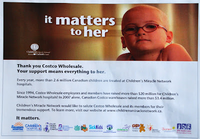 What struck me were all the logos across the bottom. It's not often where you get to see so many similar charities in one place, but to me, the one thing that stood out were the five charities that used a bear in their logo. And similar looking logos/bears they are.
Yes, I know bears are the top visual cliché when representing children... I know. I also know that when I'm developing a new logo for a charity or organization, I not only spend a ton of time getting to understand what they do but also seeing how similar charities choose to represent themselves.
Currently I am working on a logo for an umbrella organization called Access Waterloo Region. Their site and mission will reflect their dedication to helping and providing information to people with disabilities. So what's the top visual cliché to represent people with disabilities?
Yes, gold star for you - a person in a wheelchair.
Like a former creative director told me, "I don't care if you use the obvious cliché... It's a cliché for a reason. But - find a new way to twist it or spin it to make it different."
So I will be providing a couple of options with the wheelchair but hopefully doing it in a unique way. And how do I know if it is unique? I try to look up as many charities as I can that help people with disabilities and see how they've done it. And I do the complete opposite. And I also go outside of that and find other ways to design the logo where I don't need to use a wheelchair.
So, yes teddy bears work. Just find a new way to do it. Or use bunnies. And/or chicks. And/or baby ducks. (Thanks to Steve Thomas for showing me that one!)
If you or the designer/agency you've hired decide to use the most obvious visual cliché for a logo, ad or whatever... make sure they've done their homework and spent a little time doing research - otherwise - you end up with something that is no different than all the others who didn't take the time.
 What struck me were all the logos across the bottom. It's not often where you get to see so many similar charities in one place, but to me, the one thing that stood out were the five charities that used a bear in their logo. And similar looking logos/bears they are.
Yes, I know bears are the top visual cliché when representing children... I know. I also know that when I'm developing a new logo for a charity or organization, I not only spend a ton of time getting to understand what they do but also seeing how similar charities choose to represent themselves.
Currently I am working on a logo for an umbrella organization called Access Waterloo Region. Their site and mission will reflect their dedication to helping and providing information to people with disabilities. So what's the top visual cliché to represent people with disabilities?
Yes, gold star for you - a person in a wheelchair.
Like a former creative director told me, "I don't care if you use the obvious cliché... It's a cliché for a reason. But - find a new way to twist it or spin it to make it different."
So I will be providing a couple of options with the wheelchair but hopefully doing it in a unique way. And how do I know if it is unique? I try to look up as many charities as I can that help people with disabilities and see how they've done it. And I do the complete opposite. And I also go outside of that and find other ways to design the logo where I don't need to use a wheelchair.
So, yes teddy bears work. Just find a new way to do it. Or use bunnies. And/or chicks. And/or baby ducks. (Thanks to Steve Thomas for showing me that one!)
If you or the designer/agency you've hired decide to use the most obvious visual cliché for a logo, ad or whatever... make sure they've done their homework and spent a little time doing research - otherwise - you end up with something that is no different than all the others who didn't take the time.
Monday, November 19, 2007
Be appropriate
At the risk of sounding like a broken record, we must, as communicators, at all times - be appropriate. I know I've said it before but time and time again, I see work, creative, ideas, statements and so on - that is not appropriate for the audience or the subject matter. Recently I was almost guilty of the same crime.
I was developing a package for a local hospital who wanted to use funds to increase the size of the ward where they treat children who have cancer. I was trying to be clever graphically with type and making it look nice. But - duh - I was overlooking RULE #1 as a designer - let the message BE the message - just make it clear. Here are a few of the BAD ones...


So, lucky these weren't approved. I did what I should have done in the first place - which is read the copy. And as I got half way through, practically in tears, I realized that I overlooked my OWN RULE. I was not being appropriate.
So after developing a more appropriate tagline, I wanted to give it a bit of visual ompf as well. Here is the final.

Its easy to get caught up in making it "look nice" and "using all the colours" and making sure that we "stick to our brand" - but you know what - the only thing we really should be worrying about is making the creative appropriate to the audience and to the subject matter. Donors respond more to the your message than your (or my) fancy design.
Don't believe me? Then test it!
BONUS: I'm getting this for all of my clients this Christmas. Make My Logo Bigger cream!

I was developing a package for a local hospital who wanted to use funds to increase the size of the ward where they treat children who have cancer. I was trying to be clever graphically with type and making it look nice. But - duh - I was overlooking RULE #1 as a designer - let the message BE the message - just make it clear. Here are a few of the BAD ones...


So, lucky these weren't approved. I did what I should have done in the first place - which is read the copy. And as I got half way through, practically in tears, I realized that I overlooked my OWN RULE. I was not being appropriate.
So after developing a more appropriate tagline, I wanted to give it a bit of visual ompf as well. Here is the final.

Its easy to get caught up in making it "look nice" and "using all the colours" and making sure that we "stick to our brand" - but you know what - the only thing we really should be worrying about is making the creative appropriate to the audience and to the subject matter. Donors respond more to the your message than your (or my) fancy design.
Don't believe me? Then test it!
BONUS: I'm getting this for all of my clients this Christmas. Make My Logo Bigger cream!
Monday, November 12, 2007
Good things coming
Thanks for coming by. I apologize for the lack of updates but have been busy working on great things. One of which, is this blog and my web site. I have one of the most talent writers and designers in the country helping me with a complete overhaul of the site - which, in the coming weeks - I will share some of the development with you.
For those of you who are attending AFP Congress this week in Toronto, have a great time!
For those of you who are attending AFP Congress this week in Toronto, have a great time!
Monday, October 29, 2007
Walking the walk... again...
I know I recently wrote about the importance of brand and making sure every person in your organization lives, breathes and eats it... but I was reminded of how effective a brand can be when that happens.
I flew to Vancouver last week with West Jet... the no frills carrier... and yes, the seats may be cheap but the service is not.
You've maybe seen the commercials, where the stewardess totally saves the business guy by bringing his presentation, which he forgot on the flight, to his meeting, and she set up the projector, and made copies, and she...
The schtick is that all employees of West Jet are owners and that's why they care. Even the guy in front of me, when getting on the plane, made a comment to the stewardess about how happy he was to be flying with the friendliest people in the sky...
And they were. When we stopped in Calgary, the pilot came out of the cockpit, chatted with a few of us who were still on the plane. He said he was going to Starbucks and asked if any of us wanted a coffee... The pilot!
When we were taxiing towards takeoff, I glanced out my window and watched the people who loaded the luggage, fueled the jet and the signal guy - stand and wave at us as we went by them - and they kept waving until we were well past...
These people really care! They really want you to come back and fly with them again.
Can you imagine if you and your charity (or business) could deliver a similar experience to your donors (or customers)? It's not impossible, but it certainly takes a lot of work. I think when people experience a brand like West Jet, they keep coming back for more.
I, for one, will fly with them as often as I can...
I flew to Vancouver last week with West Jet... the no frills carrier... and yes, the seats may be cheap but the service is not.
You've maybe seen the commercials, where the stewardess totally saves the business guy by bringing his presentation, which he forgot on the flight, to his meeting, and she set up the projector, and made copies, and she...
The schtick is that all employees of West Jet are owners and that's why they care. Even the guy in front of me, when getting on the plane, made a comment to the stewardess about how happy he was to be flying with the friendliest people in the sky...
And they were. When we stopped in Calgary, the pilot came out of the cockpit, chatted with a few of us who were still on the plane. He said he was going to Starbucks and asked if any of us wanted a coffee... The pilot!
When we were taxiing towards takeoff, I glanced out my window and watched the people who loaded the luggage, fueled the jet and the signal guy - stand and wave at us as we went by them - and they kept waving until we were well past...
These people really care! They really want you to come back and fly with them again.
Can you imagine if you and your charity (or business) could deliver a similar experience to your donors (or customers)? It's not impossible, but it certainly takes a lot of work. I think when people experience a brand like West Jet, they keep coming back for more.
I, for one, will fly with them as often as I can...
Monday, October 22, 2007
White Space
As a designer, I am a massive fan of white space. It can take a boring layout and make it interesting, especially if you have no images at your disposal or, an image just wouldn't make sense.
Without images, you have just two elements to work with. Black type and white paper. If you merely fill the page with type - it blends into a large field of gray. And it's visually boring.
 You can pull in the reader but widening the margins and giving the mass of type some shape. And shape is what we are after.
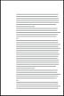 Here is another example. A leaflet sized list of Patrons. No images, all type. Set in Times New Roman. It's pretty much filled out the way you would type it out. Visually this page is totally flat.
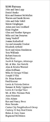
So let's add some white space to the leaflet and see what happens.

So now we have shape, we now have visual interest.

We now have a piece that begs to be looked at and read. We made the head bigger and body a little smaller and set it in a classic face (Adobe Garamond). The actualy text block is smaller but contains the same amount of information. Also by adding a neutral gray as the background, we make it a little easier on the eyes (as opposed to black on white).
Here is another way of setting it up. By turning the page we can add even more content and create a new type of shape.
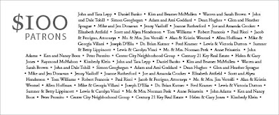 Also, the stair step shape visually places your eye right into the top left corner...
 Yes, sometimes we are at the mercy of content... But either cut copy or add more pages... without any visual interest (using white space alone or white space and images) your mail, brochure, newsletter will not get read and your message will not be heard.
Thanks to Before and After magazine for the inspiration.
 You can pull in the reader but widening the margins and giving the mass of type some shape. And shape is what we are after.
 Here is another example. A leaflet sized list of Patrons. No images, all type. Set in Times New Roman. It's pretty much filled out the way you would type it out. Visually this page is totally flat.
So let's add some white space to the leaflet and see what happens.

So now we have shape, we now have visual interest.

We now have a piece that begs to be looked at and read. We made the head bigger and body a little smaller and set it in a classic face (Adobe Garamond). The actualy text block is smaller but contains the same amount of information. Also by adding a neutral gray as the background, we make it a little easier on the eyes (as opposed to black on white).
Here is another way of setting it up. By turning the page we can add even more content and create a new type of shape.
 Also, the stair step shape visually places your eye right into the top left corner...
 Yes, sometimes we are at the mercy of content... But either cut copy or add more pages... without any visual interest (using white space alone or white space and images) your mail, brochure, newsletter will not get read and your message will not be heard.
Thanks to Before and After magazine for the inspiration.
Tuesday, October 2, 2007
Controlling the experience
I just got back from Chicago, where on top of doing a little shopping and relaxing, I got to enjoy some amazing architecture.
We visited the Robie House, a home built back in 1910 by Frank Lloyd Wright. This is the first home I've visited designed by Wright and – what an experience.
It was, as we were told, one of Wright's favourite homes built in the Prairie style.
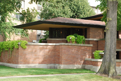
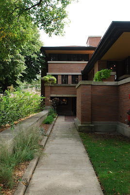
Wright was notorious for his attention to detail and controlling how a person may experience one of his homes. He was even quoted as saying if he could design the dresses of the ladies who may live in the home, he would do so in a style to suit it.
He designed the built-in shelves, furniture, windows, light fixtures, chose the paint on the walls – everything – to ensure that the way a person experienced the house – was exactly the way he intended.

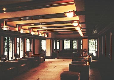
 Do you think your company or charity is like that? That every experience or touch point a consumer or donor has with you is consistent and designed right down to the tiniest detail?
Should it be?
Does it make your customer or donor feel like a witness to something special but not a part of it?
We visited the Robie House, a home built back in 1910 by Frank Lloyd Wright. This is the first home I've visited designed by Wright and – what an experience.
It was, as we were told, one of Wright's favourite homes built in the Prairie style.


Wright was notorious for his attention to detail and controlling how a person may experience one of his homes. He was even quoted as saying if he could design the dresses of the ladies who may live in the home, he would do so in a style to suit it.
He designed the built-in shelves, furniture, windows, light fixtures, chose the paint on the walls – everything – to ensure that the way a person experienced the house – was exactly the way he intended.


 Do you think your company or charity is like that? That every experience or touch point a consumer or donor has with you is consistent and designed right down to the tiniest detail?
Should it be?
Does it make your customer or donor feel like a witness to something special but not a part of it?
Monday, September 24, 2007
Surprise!!!
This weekend I was reading a Q&A with Andy Nulman from Airborne Entertainment (Montreal) who writes about "Pow!" marketing moments in his blog. The Q&A was published in the Sept 24th issue of Marketing - for those who are inclined to see the whole article.
The question is "What is surprise marketing?"
The answer is "People are basically bored and immune to most marketing. There's so much sameness. So surprise marketing really is "How do we cut through that clutter?" It is that event, the effect, the moment that basically just shocks the system... It hits you to that point where your eyes widen, your mouth turns into an "O" and you say "Wow, I never expected this." And what happens, first of all, is it cuts through all the clutter and number two, it generates word of mouth: "God, you've got to see this, it's incredible, you're not going to believe what these guys did."
I'm saying "Of course!"
You could change his answer by inserting 'donors' instead of 'people'. I have recently talked with a number of colleagues on the agency side and on the charity side and we all realize - donors are getting bored. We are not surprising anyone. We've become complacent with the norm. We just to need to make our realistic target which is the same as last year and the year before.
We need to snap out of it. The first charities that have the cahones to forget about achieving the usual - and try doing something that will snap their donors heads in attention will be rewarded. No doubt. But I'm afraid it will take a lot of convincing and a lot of people willing to take a risk for that reward for it to happen.
Thoughts?
Monday, September 17, 2007
7 surprising facts about direct-response fundraising: Thank you Donor Power Blog
This falls into the "Passing along great information" category.
From the September 5th, Donor Power Blog posting:
7 surprising facts about direct-response fundraising:
1. Blank carrier envelopes usually out-perform envelopes with teasers.
2. Longer letters perform better. Usually. There are exceptions.
3. The most-read part of a fundraising letter is the P.S.
4. Typos improve response. I can't prove this, but it seems to be true.
5. Mail recipients spend more time looking at the back of the envelope than the front.
6. Religious people give more to non-religious causes than non-religious people. Religious people give more to everything.
7. The most powerful predictor that a donor will give is the recency of her previous gift.
Here's my two cents on these 7:
1. I think I've stated before how far too often, adding a teaser does absolutely nothing to entice the donor to open the envelope. If you can come up with a tagline that is appropriate and tells the donor that there is something inside that they really need to see/read - go for it.
2. Longer letters often do better - it's true. Most often if it is a prospect piece. You need space to do more selling to that new donor, keep it focused on your mission. I've seen it tested - and again in prospecting tends to beat short letters. But I would bet if you were mailing a Renewal 3 mailing and it was 6 pages - a short one, 1 pager, would beat the pants off it.
3. The P.S. is your first/last chance to make that donor give - so reiterate the importance of the mailing and why you need their support.
4. Typo's: I've never heard of this... would love to know if anyone has ever had the guts to test this. I, for one, can't imagine trying to convince a charity that typos in their letter is ok...
5. I have always thought - if you have 2 sides to an envelope then you have 2 sides to convince the donor to open it. But back to point 1 - sometimes an "official" looking envelope with just a logo and return address or just a return address can do better for the mailing.
6. Sounds like common sense this one.
7. There are people in our sector who can tell you if there is such a thing as mailing someone too much or too often. But I think, if you have a need and you can express that need for a gift, then mail your donors. Do not mail for the sake of mailing. And I hate to say it - there are far too many charities mailing for the sake of mailing.
BACK TO YOU: I need your feedback. What are some topics you would like to see addressed here? Please send any comments you may have to jlepp@ideadesign.ca or post them here! Thanks.
From the September 5th, Donor Power Blog posting:
7 surprising facts about direct-response fundraising:
1. Blank carrier envelopes usually out-perform envelopes with teasers.
2. Longer letters perform better. Usually. There are exceptions.
3. The most-read part of a fundraising letter is the P.S.
4. Typos improve response. I can't prove this, but it seems to be true.
5. Mail recipients spend more time looking at the back of the envelope than the front.
6. Religious people give more to non-religious causes than non-religious people. Religious people give more to everything.
7. The most powerful predictor that a donor will give is the recency of her previous gift.
Here's my two cents on these 7:
1. I think I've stated before how far too often, adding a teaser does absolutely nothing to entice the donor to open the envelope. If you can come up with a tagline that is appropriate and tells the donor that there is something inside that they really need to see/read - go for it.
2. Longer letters often do better - it's true. Most often if it is a prospect piece. You need space to do more selling to that new donor, keep it focused on your mission. I've seen it tested - and again in prospecting tends to beat short letters. But I would bet if you were mailing a Renewal 3 mailing and it was 6 pages - a short one, 1 pager, would beat the pants off it.
3. The P.S. is your first/last chance to make that donor give - so reiterate the importance of the mailing and why you need their support.
4. Typo's: I've never heard of this... would love to know if anyone has ever had the guts to test this. I, for one, can't imagine trying to convince a charity that typos in their letter is ok...
5. I have always thought - if you have 2 sides to an envelope then you have 2 sides to convince the donor to open it. But back to point 1 - sometimes an "official" looking envelope with just a logo and return address or just a return address can do better for the mailing.
6. Sounds like common sense this one.
7. There are people in our sector who can tell you if there is such a thing as mailing someone too much or too often. But I think, if you have a need and you can express that need for a gift, then mail your donors. Do not mail for the sake of mailing. And I hate to say it - there are far too many charities mailing for the sake of mailing.
BACK TO YOU: I need your feedback. What are some topics you would like to see addressed here? Please send any comments you may have to jlepp@ideadesign.ca or post them here! Thanks.
Monday, September 10, 2007
This one's for YOU
Yes - you.
Can I remind you of something?
It's not all about you.
You need to make it about them - the donor.
Yes, you do good things and yes, you may have worked very hard to do those good things - but you would be nothing with them.
I mention this because as obvious as it seems, it is often forgotten.
Looking through a stack of mail I see:
"Newsletter enclosed."
"Camp is good medicine!" (Camp Trillium)
"Special gift enclosed!"
"Providing friendship, understanding and support"
It's an easy fix. Involve the donor.
"Your important newsletter is inside"
"You can let kids be kids again." (Camp Trillium)
"A special gift for you is enclosed."
And so on.
And this goes for the whole of the package. Keep your donor involved. Always.
Without them, there would be no "you".
_______
From a recent Letters to the Editor
"I am a senior and would like to tell people in charge of collecting donations that I don't want to receive any more free gifts.
I have hundreds of labels with my name and address on them, and won't be able to use them all.
I have sent in my donations with the message, "Do not send me any more free gifts," but they keep on coming, and I don't want my donations spent on postage, etc.
Please, just send me my receipt and I'll donate again next year. I live in a seniors' building and I'm not the only one complaining about wasting our donations."
You donor has spoken.
I know what you are saying - 'address labels work' - but you need to find ways to not alienate those they don't work for.
Can I remind you of something?
It's not all about you.
You need to make it about them - the donor.
Yes, you do good things and yes, you may have worked very hard to do those good things - but you would be nothing with them.
I mention this because as obvious as it seems, it is often forgotten.
Looking through a stack of mail I see:
"Newsletter enclosed."
"Camp is good medicine!" (Camp Trillium)
"Special gift enclosed!"
"Providing friendship, understanding and support"
It's an easy fix. Involve the donor.
"Your important newsletter is inside"
"You can let kids be kids again." (Camp Trillium)
"A special gift for you is enclosed."
And so on.
And this goes for the whole of the package. Keep your donor involved. Always.
Without them, there would be no "you".
_______
From a recent Letters to the Editor
"I am a senior and would like to tell people in charge of collecting donations that I don't want to receive any more free gifts.
I have hundreds of labels with my name and address on them, and won't be able to use them all.
I have sent in my donations with the message, "Do not send me any more free gifts," but they keep on coming, and I don't want my donations spent on postage, etc.
Please, just send me my receipt and I'll donate again next year. I live in a seniors' building and I'm not the only one complaining about wasting our donations."
You donor has spoken.
I know what you are saying - 'address labels work' - but you need to find ways to not alienate those they don't work for.
Tuesday, September 4, 2007
Teasers vs no Teasers
Last week, I got my daily e-news from Donor Power blog. The subject was "To tease or not to tease". I won't totally re-iterate the findings (based on Mal Warwick's own research) but the bottom line is - test it. OR if you don't want to test it - ask your self this: Is it appropriate?
From my side of the desk, too often, I see teasers added for the sake of adding a teaser. There have been many packages where I have been asked to add a teaser and I would be willing to bet it hindered the response - made it seem to (excuse the expression) junk-maily...
Of course, I asked to test it - but as we know - often there isn't the budget to do so.
Get out of the habit of adding a teaser for the sake of doing it. Trust your gut - if you have a great line that you know will make people want to tear open the package - use it, but if not - don't.
Do you wonder if your donors ever feel this way?

From my side of the desk, too often, I see teasers added for the sake of adding a teaser. There have been many packages where I have been asked to add a teaser and I would be willing to bet it hindered the response - made it seem to (excuse the expression) junk-maily...
Of course, I asked to test it - but as we know - often there isn't the budget to do so.
Get out of the habit of adding a teaser for the sake of doing it. Trust your gut - if you have a great line that you know will make people want to tear open the package - use it, but if not - don't.
Do you wonder if your donors ever feel this way?

Monday, August 20, 2007
Designing a logo
Nothing is more frustrating for me, as a graphic designer, to have to design a one colour or two colour piece (like direct mail, like an ad) for a charity using their brand *new* logo!!!!
Yes, having a new logo for your organization or part of your brand is a very exciting time. It's a fresh start and maybe brings you up to date and contemporary.
BUT, there are a few things, to remember when looking at a new logo.
If I need to design a one colour or two colour piece and all I have is a beautiful looking logo that is 4 colours (cmyk), then I'm going to have a bit of an issue.
If all I have is a beautiful looking logo that IS two colours (two spot colours), but uses a soft teal and light gray I am also going to have an issue.
Time and time again, I see these new logos developed and the colours are not suitable to one or two colour applications. The problem?
Having an logo with 2 soft colours, and being limited to 2 colours, makes any type (which should be set in black or a dominant colour) very hard or impossible - to read... Any image you may want to use, especially if you want to use one of the PMS colours from the logo - will also look washed out and hard to reproduce.
Here is what I do:
I design the logo in black. If it works well in black, then adding colour will be the easy part.
I then design a 2 spot colour version. And, I always make sure one of those 2 colours is a dark colour. (Think, blue, dark green, deep red, black, etc).
I may also design a 4 colour logo based on the break down of the PMS colours.
I then make sure my contact at the organization has every version, in every format, as well as fonts of the *new* logo.
The bottom line is: Do not design a logo for a charity using soft colours (like yellow, teal, grey, etc) unless is is complimenting a strong colour first.
UPDATE: A few weeks ago I wrote about the food bank situation in Hamilton - which I am happy to say has improved significantly. I also linked my thoughts to The Poverty Project page at the Spectator. Shortly after, I did notice that the ad had been revised to:
 It is great to see a bolder call to action. The need is clearly outlined and easy to read.
Criticisms: Why not an image of Hamiltonian child? And why not bigger? The shot isn't bad but and great eye contact is everything... so use it!
UPDATE TWO: CNIB Comedy Gala: For those of you picked option 1:

You were correct! Personally, I knew it was the "safest" option... but maybe feel a little disappointed that one of the more visually interesting ones, was not chosen. Also, we have completed all the final tweaks and changes to the poster and some of the messaging that I felt were not adding to the Gala was added back in, but sometimes, what's not important to me is important to the client. Here is the final poster:
Yes, having a new logo for your organization or part of your brand is a very exciting time. It's a fresh start and maybe brings you up to date and contemporary.
BUT, there are a few things, to remember when looking at a new logo.
If I need to design a one colour or two colour piece and all I have is a beautiful looking logo that is 4 colours (cmyk), then I'm going to have a bit of an issue.
If all I have is a beautiful looking logo that IS two colours (two spot colours), but uses a soft teal and light gray I am also going to have an issue.
Time and time again, I see these new logos developed and the colours are not suitable to one or two colour applications. The problem?
Having an logo with 2 soft colours, and being limited to 2 colours, makes any type (which should be set in black or a dominant colour) very hard or impossible - to read... Any image you may want to use, especially if you want to use one of the PMS colours from the logo - will also look washed out and hard to reproduce.
Here is what I do:
I design the logo in black. If it works well in black, then adding colour will be the easy part.
I then design a 2 spot colour version. And, I always make sure one of those 2 colours is a dark colour. (Think, blue, dark green, deep red, black, etc).
I may also design a 4 colour logo based on the break down of the PMS colours.
I then make sure my contact at the organization has every version, in every format, as well as fonts of the *new* logo.
The bottom line is: Do not design a logo for a charity using soft colours (like yellow, teal, grey, etc) unless is is complimenting a strong colour first.
UPDATE: A few weeks ago I wrote about the food bank situation in Hamilton - which I am happy to say has improved significantly. I also linked my thoughts to The Poverty Project page at the Spectator. Shortly after, I did notice that the ad had been revised to:
 It is great to see a bolder call to action. The need is clearly outlined and easy to read.
Criticisms: Why not an image of Hamiltonian child? And why not bigger? The shot isn't bad but and great eye contact is everything... so use it!
UPDATE TWO: CNIB Comedy Gala: For those of you picked option 1:

You were correct! Personally, I knew it was the "safest" option... but maybe feel a little disappointed that one of the more visually interesting ones, was not chosen. Also, we have completed all the final tweaks and changes to the poster and some of the messaging that I felt were not adding to the Gala was added back in, but sometimes, what's not important to me is important to the client. Here is the final poster:

Monday, August 13, 2007
CNIB Gala: Part 2: Time to present
Once I sat down and tried to figure some visual ways to present comedy (which beyond microphones, empty stages and laughing masks - there aren't many) I had to figure out what was important, in terms of content, and what wasn't. With something like a poster, that may be hung up public space, keep in mind, you have mere seconds to make an impression and get your message across. This is no time for all the information about your event, or your product, or whatever... the basics - the most important information only. And from a visual point of view - again - simple. One big visual is better than 10 small ones.
So here are the four options that went to the client for presentation:


Again, these are the final 4 options that I presented to the client (I'll show what didn't make it another time).
I wanted the idea of "comedy" to really come through and felt, just before I needed to present them, I hadn't really accomplished that.
I picked the brain of ubr-creative Kim McMullen for a quick brainstorm to see what we could do to make them just a bit better.
I had already designed the option 2 - "talking mouth" Mary Walsh, but didn't feel like it was working, but with the addition of the right kind of copy, and typeset properly, it started to work for me.
Option 3 was my attempt for big and clean design. Nothing getting in the way of the messaging.
Option 4 had started out as another big and clean design poster - but tried to liven it up with a bit of scratching, sketching around the mic. Kim suggested I go all the way - it was a comedy show after all. Show - I got to totally deface Mary Walsh. I have to admit, I did think to myself "I can't do this to Mary can I?"
But I did. It was appropriate and added that touch of whimsy that was really missing.
Next time: What the client choose and the options that didn't see the light of day. Any predictions? Let me know what you think the client choose.
So here are the four options that went to the client for presentation:


Again, these are the final 4 options that I presented to the client (I'll show what didn't make it another time).
I wanted the idea of "comedy" to really come through and felt, just before I needed to present them, I hadn't really accomplished that.
I picked the brain of ubr-creative Kim McMullen for a quick brainstorm to see what we could do to make them just a bit better.
I had already designed the option 2 - "talking mouth" Mary Walsh, but didn't feel like it was working, but with the addition of the right kind of copy, and typeset properly, it started to work for me.
Option 3 was my attempt for big and clean design. Nothing getting in the way of the messaging.
Option 4 had started out as another big and clean design poster - but tried to liven it up with a bit of scratching, sketching around the mic. Kim suggested I go all the way - it was a comedy show after all. Show - I got to totally deface Mary Walsh. I have to admit, I did think to myself "I can't do this to Mary can I?"
But I did. It was appropriate and added that touch of whimsy that was really missing.
Next time: What the client choose and the options that didn't see the light of day. Any predictions? Let me know what you think the client choose.
Subscribe to:
Posts (Atom)

