Without images, you have just two elements to work with. Black type and white paper. If you merely fill the page with type - it blends into a large field of gray. And it's visually boring.
 You can pull in the reader but widening the margins and giving the mass of type some shape. And shape is what we are after.
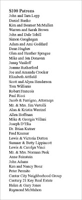
 Here is another example. A leaflet sized list of Patrons. No images, all type. Set in Times New Roman. It's pretty much filled out the way you would type it out. Visually this page is totally flat.

So let's add some white space to the leaflet and see what happens.

So now we have shape, we now have visual interest.

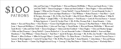
We now have a piece that begs to be looked at and read. We made the head bigger and body a little smaller and set it in a classic face (Adobe Garamond). The actualy text block is smaller but contains the same amount of information. Also by adding a neutral gray as the background, we make it a little easier on the eyes (as opposed to black on white).
Here is another way of setting it up. By turning the page we can add even more content and create a new type of shape.
 Also, the stair step shape visually places your eye right into the top left corner...
 Yes, sometimes we are at the mercy of content... But either cut copy or add more pages... without any visual interest (using white space alone or white space and images) your mail, brochure, newsletter will not get read and your message will not be heard.
Thanks to Before and After magazine for the inspiration.
 You can pull in the reader but widening the margins and giving the mass of type some shape. And shape is what we are after.
 Here is another example. A leaflet sized list of Patrons. No images, all type. Set in Times New Roman. It's pretty much filled out the way you would type it out. Visually this page is totally flat.
So let's add some white space to the leaflet and see what happens.

So now we have shape, we now have visual interest.

We now have a piece that begs to be looked at and read. We made the head bigger and body a little smaller and set it in a classic face (Adobe Garamond). The actualy text block is smaller but contains the same amount of information. Also by adding a neutral gray as the background, we make it a little easier on the eyes (as opposed to black on white).
Here is another way of setting it up. By turning the page we can add even more content and create a new type of shape.
 Also, the stair step shape visually places your eye right into the top left corner...
 Yes, sometimes we are at the mercy of content... But either cut copy or add more pages... without any visual interest (using white space alone or white space and images) your mail, brochure, newsletter will not get read and your message will not be heard.
Thanks to Before and After magazine for the inspiration.

No comments:
Post a Comment