I know I recently wrote about the importance of brand and making sure every person in your organization lives, breathes and eats it... but I was reminded of how effective a brand can be when that happens.
I flew to Vancouver last week with West Jet... the no frills carrier... and yes, the seats may be cheap but the service is not.
You've maybe seen the commercials, where the stewardess totally saves the business guy by bringing his presentation, which he forgot on the flight, to his meeting, and she set up the projector, and made copies, and she...
The schtick is that all employees of West Jet are owners and that's why they care. Even the guy in front of me, when getting on the plane, made a comment to the stewardess about how happy he was to be flying with the friendliest people in the sky...
And they were. When we stopped in Calgary, the pilot came out of the cockpit, chatted with a few of us who were still on the plane. He said he was going to Starbucks and asked if any of us wanted a coffee... The pilot!
When we were taxiing towards takeoff, I glanced out my window and watched the people who loaded the luggage, fueled the jet and the signal guy - stand and wave at us as we went by them - and they kept waving until we were well past...
These people really care! They really want you to come back and fly with them again.
Can you imagine if you and your charity (or business) could deliver a similar experience to your donors (or customers)? It's not impossible, but it certainly takes a lot of work. I think when people experience a brand like West Jet, they keep coming back for more.
I, for one, will fly with them as often as I can...
Monday, October 29, 2007
Monday, October 22, 2007
White Space
As a designer, I am a massive fan of white space. It can take a boring layout and make it interesting, especially if you have no images at your disposal or, an image just wouldn't make sense.
Without images, you have just two elements to work with. Black type and white paper. If you merely fill the page with type - it blends into a large field of gray. And it's visually boring.
 You can pull in the reader but widening the margins and giving the mass of type some shape. And shape is what we are after.
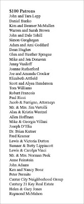
 Here is another example. A leaflet sized list of Patrons. No images, all type. Set in Times New Roman. It's pretty much filled out the way you would type it out. Visually this page is totally flat.
So let's add some white space to the leaflet and see what happens.

So now we have shape, we now have visual interest.

We now have a piece that begs to be looked at and read. We made the head bigger and body a little smaller and set it in a classic face (Adobe Garamond). The actualy text block is smaller but contains the same amount of information. Also by adding a neutral gray as the background, we make it a little easier on the eyes (as opposed to black on white).
Here is another way of setting it up. By turning the page we can add even more content and create a new type of shape.
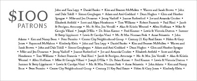 Also, the stair step shape visually places your eye right into the top left corner...
 Yes, sometimes we are at the mercy of content... But either cut copy or add more pages... without any visual interest (using white space alone or white space and images) your mail, brochure, newsletter will not get read and your message will not be heard.
Thanks to Before and After magazine for the inspiration.
 You can pull in the reader but widening the margins and giving the mass of type some shape. And shape is what we are after.
 Here is another example. A leaflet sized list of Patrons. No images, all type. Set in Times New Roman. It's pretty much filled out the way you would type it out. Visually this page is totally flat.
So let's add some white space to the leaflet and see what happens.

So now we have shape, we now have visual interest.

We now have a piece that begs to be looked at and read. We made the head bigger and body a little smaller and set it in a classic face (Adobe Garamond). The actualy text block is smaller but contains the same amount of information. Also by adding a neutral gray as the background, we make it a little easier on the eyes (as opposed to black on white).
Here is another way of setting it up. By turning the page we can add even more content and create a new type of shape.
 Also, the stair step shape visually places your eye right into the top left corner...
 Yes, sometimes we are at the mercy of content... But either cut copy or add more pages... without any visual interest (using white space alone or white space and images) your mail, brochure, newsletter will not get read and your message will not be heard.
Thanks to Before and After magazine for the inspiration.
Tuesday, October 2, 2007
Controlling the experience
I just got back from Chicago, where on top of doing a little shopping and relaxing, I got to enjoy some amazing architecture.
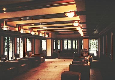
We visited the Robie House, a home built back in 1910 by Frank Lloyd Wright. This is the first home I've visited designed by Wright and – what an experience.
It was, as we were told, one of Wright's favourite homes built in the Prairie style.
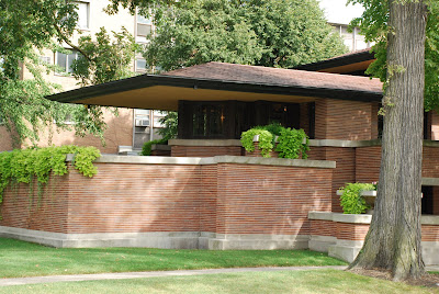
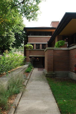
Wright was notorious for his attention to detail and controlling how a person may experience one of his homes. He was even quoted as saying if he could design the dresses of the ladies who may live in the home, he would do so in a style to suit it.
He designed the built-in shelves, furniture, windows, light fixtures, chose the paint on the walls – everything – to ensure that the way a person experienced the house – was exactly the way he intended.

 Do you think your company or charity is like that? That every experience or touch point a consumer or donor has with you is consistent and designed right down to the tiniest detail?
Should it be?
Does it make your customer or donor feel like a witness to something special but not a part of it?
We visited the Robie House, a home built back in 1910 by Frank Lloyd Wright. This is the first home I've visited designed by Wright and – what an experience.
It was, as we were told, one of Wright's favourite homes built in the Prairie style.


Wright was notorious for his attention to detail and controlling how a person may experience one of his homes. He was even quoted as saying if he could design the dresses of the ladies who may live in the home, he would do so in a style to suit it.
He designed the built-in shelves, furniture, windows, light fixtures, chose the paint on the walls – everything – to ensure that the way a person experienced the house – was exactly the way he intended.


 Do you think your company or charity is like that? That every experience or touch point a consumer or donor has with you is consistent and designed right down to the tiniest detail?
Should it be?
Does it make your customer or donor feel like a witness to something special but not a part of it?
Subscribe to:
Comments (Atom)
