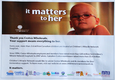
 What struck me were all the logos across the bottom. It's not often where you get to see so many similar charities in one place, but to me, the one thing that stood out were the five charities that used a bear in their logo. And similar looking logos/bears they are.
Yes, I know bears are the top visual cliché when representing children... I know. I also know that when I'm developing a new logo for a charity or organization, I not only spend a ton of time getting to understand what they do but also seeing how similar charities choose to represent themselves.
Currently I am working on a logo for an umbrella organization called Access Waterloo Region. Their site and mission will reflect their dedication to helping and providing information to people with disabilities. So what's the top visual cliché to represent people with disabilities?
Yes, gold star for you - a person in a wheelchair.
Like a former creative director told me, "I don't care if you use the obvious cliché... It's a cliché for a reason. But - find a new way to twist it or spin it to make it different."
So I will be providing a couple of options with the wheelchair but hopefully doing it in a unique way. And how do I know if it is unique? I try to look up as many charities as I can that help people with disabilities and see how they've done it. And I do the complete opposite. And I also go outside of that and find other ways to design the logo where I don't need to use a wheelchair.
So, yes teddy bears work. Just find a new way to do it. Or use bunnies. And/or chicks. And/or baby ducks. (Thanks to Steve Thomas for showing me that one!)
If you or the designer/agency you've hired decide to use the most obvious visual cliché for a logo, ad or whatever... make sure they've done their homework and spent a little time doing research - otherwise - you end up with something that is no different than all the others who didn't take the time.


