In Hamilton, Ontario, they are having a massive problem.
It's summer time and people are out, having fun, going to cottages, building decks, swimming, bbq'ing.
Also, it's summer time, and some other people are deciding between electricity or food for their children, bus fare to work or food for their children, rent or food for their children. It almost every city center across this country of ours, there exists food banks of all kinds to help these families that are having to make some very hard choices.
I worked with Daily Bread Food Bank in Toronto for a few years on their direct mail. It was always the same - Thanksgiving and Christmas mailings always did well. Summer mailings did not.
In Hamilton, food banks are having to close their doors. Not enough food and not enough cash. So what happens to these people who, unfortunately, rely on the food banks to help feed their families?
My wife and I were watching the news last week. At the top of the news was the story about the crisis. 4 minutes long. Really well done and sad. Tara has moved closer to the TV, pen and paper, writing down the things they need-getting her credit card from her wallet.
And then - they moved to their next story.
"Where the "f" is the call to action???" she cried, and then clasping her hand over her mouth when she realized she was in the presence of our small, impressionable children.
There was no phone number, no web site, no way to give and therefore, a complete and utter waste of air time.
The Hamilton Spectator actually posted an ad in it's paper on Saturday.
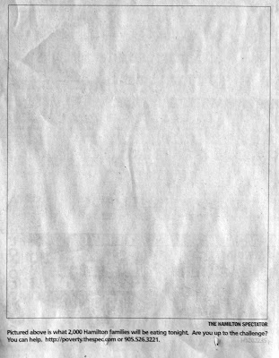
Clever idea. Very poor execution. At least there is a call to action - in barely there 10 pt type. When you view the ad in the context of the page:
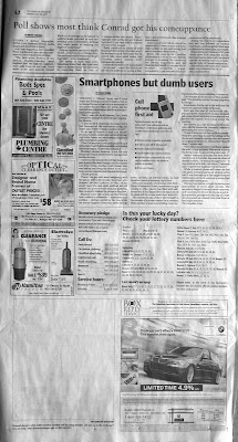
Yes - that's it there at the bottom of the page - the white block does help it get noticed - but - for crying out loud - at least make the contact info stand out.
This sort of thing frustrates me - almost makes me lie awake at night.
If you are a charity and you get any free ad space or air time, get your story heard and then SHOUT your contact info - let the donors help. If you make it hard for people, then you may not get the help you need.
If you want tp help, you can read a little more about it here or call 905.526.3221.
Monday, July 30, 2007
Monday, July 16, 2007
Factors that make or break your direct mail campaign
I've been reading one of the 'fundraising bibles' called Achieving Excellence in Fund Raising. It covers everything from Philosophy to Ethics, Sources and Methods. A book that should probably be on the bed stand of every fundraiser.
The prolific Mal Warwick, in Chapter 19, covers the ins and outs of Direct Mail. In a section called "Factors That Make The Most Difference In A Direct Mail Campaign", he states that you (you being a fundraiser at your charity) are responsible for HALF the response to your direct mail. Your charity's track record, the power of your message, the quality and visability of your organization's leadership, publicity and the ties of your work to issues of broad public concern are all your responsibility.
The other half, according to Mal, breaks down like this:
List Selection - 25%
The "offer" - 10%
Copywriting - 5%
Format - 5%
Design - 5%
and lastly,
Timing - which Mal states, is terribly hard to put a fixed value on but - can make a big difference in your mailing.
As a designer - I'm comfortable with 5% - I would love to think that the way I wrap the font around some pretty graphic, or my witty use of the colour magenta makes a mailing double or triple its expected targets - but let's face facts - it doesn't. It was part of the success or failure, but not wholly responsible for either.
I'll make you a promise. I'll remember that the next time I work on a direct mail pack for you - if you do too. If you concentrate on the things that REALLY matter, like your messaging, I'll concentrate on making sure it comes through as CLEAR as possible.
I promise.
Monday, July 9, 2007
Case Study: CNIB Gala - Part One
Idea Design was asked by Patti Johnstone, from CNIB Hamilton to help design the look and feel for the 6th Annual Gala to be held in January.
In the coming months, I will share the process of this job.
We got together Friday to discuss the job and look at our timelines. We have to present a few options to te Board by the end of July so there isn't a lot of time to mess about.
In the past it has be called the "CNIB Magic Dot Gala". This year's theme is Comedy Night featuring Mary Walsh and Samba dancers, the recommended colours are pink and black.
You can see already we are in a bit of trouble. If the theme is comedy, let the theme be comedy. Why is it called "CNIB Magic Dot Gala"? Why pink and black? CNIB's colours are green and dark green. Does the image of Mary Walsh say "comedy"? I'm not sure. Leslie Neilson - yes... Mary Walsh? I don't think so. Samba dancers? What does that have to do with comedy?
Let's communicate one thing. Right?
We need to design 24x36 posters (mostly used at the event-which is good to know), an 8.5x11 mini poster which will be mailed, faxed and inserted here and there - this will be the primary ticket seller - so it needs to cover a lot information. There will also be tickets and ads that need to be put together.
Next steps will be to simplify the message, from a visual and written point of view and develop a few theme concepts.
Stay tuned.
Tuesday, July 3, 2007
FREE Test Idea
First off, Happy Canada Day and Happy 4th of July for my American friends.
Today's post shall be short and sweet. Here is a quick, FREE idea for a test for those of you who design, write or produce direct mail.
On your coupon, almost all contain a line that reads something like "Please turn over to give monthly..." or something like that. We tested setting it in a handwriting font verses using a font we were using everywhere else.
The handwriting version won. Speaking with a few others who tested it found the same result.
I would love to hear about your tests - especially the unusual ones - if you have any you would like to share, please pass it along.
Finally - please feel free to comment on any post, any time. I want this to be more of a forum for anyone who might be interested in adding their voice to the discussion. So please add your voice and thoughts.
John
Subscribe to:
Posts (Atom)