When did charities get afraid of standing out?
I used to work at a pharmaceutical agency in Toronto. My creative director, Gord Schwab, said to me, not long after I started, "We do not do 'smiley, happy people' ads". And we never did. Yes, occasionally the clients would come and say, "...but we want a smiling, older couple, looking happy because our product helped them...". Back then, the only advertising you could do was direct to doctors - they were the audience. We needed to show them how the drug/product worked and how they helped people by prescribing it. No "smiley, happy people" ads. They won tons of awards and sold a lot of product for their clients.
I read about another re-branding for a high profile charity. In this case, it's the United Way of Greater Toronto.
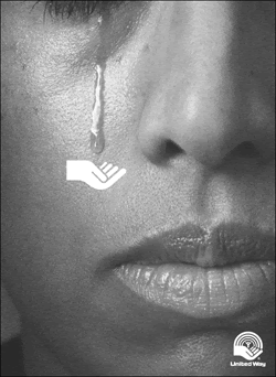
You'll remember some of the older creative that was done for United Way:

And now:
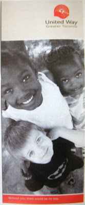
In the June 11, 2007 issue of Marketing Magazine, the article discussing the re-brand reads, "In the past, the UWGT had pulled on heart strings by showing troubled people and stressing the need for financial contributions... Now the focus is on prevention and the positive impact of the United Way's work..."
How and where does the donor fit into this? Where is the "me" or the "you"? It doesn't need to be all death and destruction, but the donor needs to be involved and see how they help. It's these sorts of visual concepts that get noticed. I think that's why the old ads and visuals worked so well.
And by the way, when did 'pulling on heartstrings' become a bad thing?
A few years ago, I was working on creative for a international organization - the concept was - by joining this monthly giving program, you were helping immediately, and all the time, everywhere... I had developed a conceptual image of "the donor" reaching out with a spoon and feeding a hungry child who was sitting in his mothers lap...
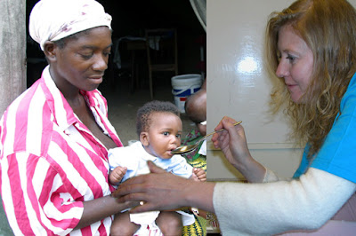
It's a little rough, but it shows the donor helping now. It shows how being a part of this program, you are make a difference immediately.
Sure, you could show a bunch of happy kids eating or playing... but what do you think is stronger?
As the demographics of this country change, so does they way we need to communicate. If it's all "smiley, happy people" ads or brochures - what will make you different from the next charity?
SIDE NOTE: In the paper this weekend was a fantastic article about a site called Kiva.org. This is - in a sense - fundraising in the 21st Century and a great idea that could be applied to many charities today. In a nutshell "Kiva lets you connect with and loan money to unique small businesses in the developing world. By choosing a business on Kiva.org, you can "sponsor a business" and help the world's working poor make great strides towards economic independence. Throughout the course of the loan (usually 6-12 months), you can receive email journal updates from the business you've sponsored. As loans are repaid, you get your loan money back." You get to pick the business and how much you loan - and make an amazing difference.
Now that's a fantastic idea.
Monday, June 25, 2007
Monday, June 18, 2007
Gone fishin'...
Thanks for the visit - we/me is off fishing today but will return next week with a look at the big melting pot that charities keep jumping into... Have a great week.
Monday, June 11, 2007
Summertime
Summer is a tough time to be mailing people. People are busy out in their gardens, visiting with friends, enjoying the weather. But the mail must not stop right? You still need people's attention and donations - of course. Any your mail plan, provided by your agency if you have one, says you have a mailing and IT MUST drop June 30!!!
Here are a few words of advice. Do not mail a plain white, #10 envelope and package. That's it.
90% (that's my guessimation) of the organizations with a piece of mail that's landing in the mailboxes of donors all across Canada are mailing plain white, #10 envelope packages. You need to stand out! You need to compete!
Please consider - mailing a envelope that's bigger or smaller than a #10! Make it blue, green or pink! You can print a colour all over or maybe use a colour stock.
When Jane Sample opens her mailbox, guess what will get her attention, and likely get it opened?
Just a few words of advice.
Also: On Friday I took part in the Big Bike Ride for Heart and Stroke as part of a team for Fluid Media and Banko Photography from Hamilton. If you ever get a chance to ride on one of these big bikes - make sure you do! It is quite easy and a lot of fun. The Heart and Stroke folks did a fantastic job at getting everyone ready to ride and getting their message heard! Here are a few pictures from the event (Thanks to Sandra Mulder from Banko Photographic).
Sunday, June 3, 2007
Your "Brand".
I'm not a branding expert. I can be upfront about that. But I do understand a bit about what a "brand" is and how it is a part of your business or charity.
Food for thought:
"We persist in seeing a "brand" as the "external image" of a company, or of a product or service. Instead, we must learn that branding goes straight to the heart (and comes straight from the heart) of an enterprise. Bottom Line: Effective branding is far more internal than external." - Tom Peters Essentials, "Design"
Consider this: Is the Apple brand this:
or this:
I would argue that Steve Jobs is a bigger part of the Apple brand than the logo.
Recently I was talking to a client and I expressed my extreme pleasure at having them as a client. I have dealt with seven out of eight people from this organization separately - and they all were polite, enthusiastic, helpful, creative, knowledgeable and driven. It shows in the work that they do and the relationships they form with their clients and suppliers. I told the client that it's obvious that every single person in their organization not only understands their "brand" but lives and breaths it.
One more example before I get to the point: Old Navy - yes, the singing, dancing commercials with a lot of happy people, young and old - sporting some funky, colourful clothes - and the music always gets the toes tapping. You see the ads in the newspaper and there are bold splashes of colour, great prices, happy people - you walk into the store, great music, colour explosions here and there, happy salespeople eager to help... that's the "Old Navy" brand.
So here is my point. In the last decade, almost every charity I have worked with has climbed aboard the "branding wagon" - for many reasons. My problem is that so many charities don't actually understand what a "brand" is.
Things like your logo, the fonts you use in your materials, colours you use - all of those things - support your brand and identify you to you donor or customer - but they are not your brand. Just a piece of it.
I read recently 'Every time you hum a television commercial jingle, decide to test a new flavor of toothpaste, or pay more than average for a cup of coffee, you, as a consumer, are revealing a relationship with a product or company that today’s savvy companies spend great amounts of time and money to develop. This relationship, measured in emotional investment, is forged by a company or product’s strategic identity — or what’s commonly referred to as its brand.
Every time a stakeholder (a customer, an employee or a client) “touches” your product, workplace or services, he or she engages in a scripted and meaningful part of the overall story of your brand.' (taken from rtkl.com)
And please note: it doesn't say anything about your font.
Agree? Disagree? Let me know.
John
Subscribe to:
Posts (Atom)