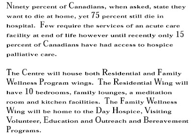
As part of my process I sat down to do the appropriate research on what the Hospice is, who it helps, who supports the Hospice and how they support it. They were in the process of wrapping up a capital campaign to help build a new hospice.
It came time to sit down and take a look at their newsletter as it presently was.
 My first thoughts were considering the audience, the typeface/font seemed dated and appeared too small and condensed vertically.
 There was nice white space around the paragraphs and around the headline so there was some room to play with. My other concerns were with the generic name and small images. They were also paying for printing 4 colours (cmyk) so I wanted to utilize that a bit more.
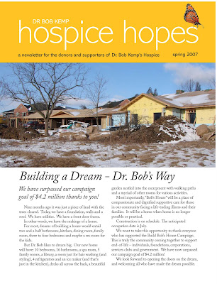
So what did I do? I started with the name first. The newsletter was going to supporters and donors and I wanted it to have a more uplifting name. "Hospice News, Hospice Bulletin, BK Bulletin, Kemp News"... none really inspired. But "Hospice Hopes"- we were getting somewhere. I felt the dark blue was a little cold and lifeless so I played with greens and yellows - colours that are alive and vibrate with energy... The use of the logo, which also may be updated at some point in the future wasn't really helping - but I liked the idea of metamorphosis and life. A small visual of a butterfly gave it that bit unique-ness that it needed. I chose a contemporary and clean typeface for the masthead called "Abadi" and "Adobe Caslon" for all body copy.
I wanted bigger visuals - which have more impact and also help to make the newsletter not seem so copy heavy. So this is what I came up with:

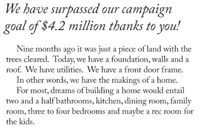
A closer look at the body copy:

One other thing I did, was leave the double spaces in between the sentences. Depending on the piece, sometimes I leave them in or remove them. At smaller font (point) sizes, having the double spaces also help with readability, even though from a typographic point of view it is incorrect.
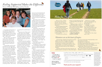
With the inside pages, I pushed for a less in more approach. But we had some great content so cutting copy was not easy. I opened the margins up as much as possible, bleed images off the sides and tried to give each element it's own space to breathe.
 Thanks to the Hospice for allowing me to help with their newsletter and congratulations on reaching their goal for their captial campaign.

No comments:
Post a Comment