Sunday, May 27, 2007

My Two Cents: Agencies and Pro-Bono Work

Flipping through the current Marketing Magazine, there is an article by Anthony Taaffe, Associate Creative Director at Extreme Group, an ad agency from Halifax. The article is called "Piloting Pro Bono". It's always interesting to read about another ad agency who is out to help save the world by doing cutting edge creative. In this case, Taaffe discusses how some of his paying clients feel slighted when they compare the work they get, verses the creative solutions that their pro bono clients get. His point is that all clients get the same 'great creative'. Fine.

Here's my complaint. The "creative" that some agencies come up with - often isn't appropriate (I've talked about that before), or, is completely out of brand or character for the charity in question and often has ZERO worth as a fundraising device. Here is the ad that Extreme came up with for Halifax's Food Bank.
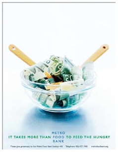
The visual as you can see is a bowl full of money.
The headline reads "It Takes More Than Food To Feed The Hungry."
Yes. That's true. Great. So now what? - So nothing, I continue to flip through my magazine or paper.

Oh hold on! Maybe I'm supposed to GIVE something - let's see, where are my glasses? Right. There does seem to be a suggestion to maybe give generously. Oh - and there is even a phone number - that's handy.

Taaffe writes "Pro bono work usually comes with the promise of a great creative opportunity. A pro bono job can provide the type of challenge that may be lacking in your everyday work, a unique opportunity to flex one's creative muscles." He goes on to say "You never ignore any client's needs and objectives, but with pro bono work, it is totally appropriate to insist on creative latitude as a prerequisite."

Really?

I thought the whole idea of working with charities is to help raise money and make a difference. I can be a bit of an idealist at times - but, it is not time to 'flex my creative muscle' - it's time to raise money.

ASK for a donation and then TELL them how to give it.

Marketing is also running a poll - I was interested to see where it stands currently. I understand that a lot of back patting can go on here - I've had charities tell me - 'Sorry but our agency of record (insert name of big name agency), is doing that work for us'. And I've heard the agencies say 'Look at this amazing ad we did for (insert charity of choice). Can you believe we got away with this? And isn't it clever?'

I would suggest that if you work at an agency or a charity to download a copy of "Why Bad Ads Happen to Good Causes" by Andy Goodman.

I know that sometimes that an ad or poster for a charity is to "increase awareness" and that's fine so long as the awareness is about the cause, not the charity. It's not you, the charity or you the agency, it's about who or what you are helping. That being said there is a great quote in Andy Goodman's piece.

Attention, Not Just Awareness
"You can throw oodles of information into a person's awareness. The problem is that everybody is doing it. Awareness is vague, general information, and doesn't by itself catalyse any action. Attention is targeted and specific. It gets people moving. In a simple analogy, awareness is the target and attention is the bull's-eye."
Thomas Davenport & John Beck, The Attention Economy

Let's get people moving.

Monday, May 21, 2007

Testing, testing, 1, 2, 3....

I know, you probably hear it all the time but I don't see charities trying it enough anymore. I know money is tight but you should constantly be testing something to see what your donors respond to and what they don't respond to.

Testing is most common with direct mail but take a cue from the corporate world - you can test anything in any media - but for now, let's take a look at direct mail.

If you have a control prospect package (which basically means it is a mailer you use annually, twice a year, etc) that consistently performs for you - you should be trying to make it better and beat it every time you mail. Here are some suggestions (and the list can be endless) - some more costly than others:

Outsides:
1. Try adding/removing/changing the tag line.
2. Using a picture vs not using a picture.
3. 4 colour vs 2 colour.
4. A different size envelope vs. the one you are currently using.
5. A differnet stock colour.
6. A first class stamp.

Insides:
1. Adding a lift note or insert vs no lift note or insert.
2. A longer/shorter letter.
3. Colours
4. Pictures
5. COPY!
6. Letter signers.

Again, once you start to think about it - it is easy to come up with some testable ideas.

That being said - there are two things you need to keep in mind. And these are also forgotten in the heat of testing...

Test one thing. Sorry, I know you've got all these great ideas, but it is the only way you'll be able to say "This test made a difference/no difference".

And - don't test things that will unlikely to change your response rate - remember - you are trying to raise money so only test things that hopefully will make more people respond and - give more money.

Agree? Disagree? Other thoughts?
John

P.S. I am hoping in the future to feature some guest bloggers so keep an eye out for that. If you have any recommendations or would like to be a guest blogger, please let me know!

BONUS: MY TWO CENTS
Recently, I travelled to Paris for a little bit of R&R. While at the Pere Lachaise Cemetery, I came across this headstone:
Talk about standing out! Talk about great use of white space! It reminds me, when you step outside the norm - the result can be amazing and inspiring!

Monday, May 14, 2007

Creative Checklist

A few years ago, I got to sit in a session hosted by Derek Humphries from the UK firm THINK Consulting. If you are into creative, and you get a chance, Derek is one of the guys you need to hear speak. His colleage Tony Elischer, is also fantastic.

As part of the session - Derek passed us a checklist of things you should look at before you release your dm/brochure/etc into the world.

1. Is it on brief? (Does the solution suit the original problem formed in the creative brief?)
2. Is it factually accurate?
3. Is it clear who we are talking to?
4. Is it clear what we are asking?
5. Have you explained why?
6. Does it sound important?
7. Is the point made simply?
8. Is the response device (for the donor) simple and easy?
9. Are we doing something that has never been done before?
10. AND MOST IMPORTANT - Does it sing?

Upon the advice of one of my readers - THE NAKED IDEA will become a weekly blog to be published every Monday starting today.

Questions? Comments? Let me know.
John

Thursday, May 10, 2007

My Two Cents: Direct Mail in Canada

One word: Boring.

I hate to generalize, but most of the direct mail produced in Canada today - is boring. And it would not be surprising to hear your donors are bored of it too.

I hear from charities all the time "Our donors are conservative, they like it like this and we don't mess with it." More often, it is the charity (or people working there) that like it like that and don't want to rock the donor boat. And I appreciate that - dollars are getting harder and harder to come by - but you may find by shaking things up a little - good things may happen.

Every few weeks when my mother-in-law comes for a visit she brings a big envelope or small box - chock full of direct mail from all over the country. She is "Jane Donor" - fits the description perfectly. 99% of what she brings me are #10 outer envelopes, white stock, with a window, with the logo in the top left corner and the return address on the back flap, a white#9 Business Reply Envelope, with Canada Post art (with maybe a "Thank you!" in the top left corner) and a 8.5" x 14" letter/coupon.

99%.

So I recycle those. I look at the one or two that do something different. Anything!

Look at this way - if you arrange the furniture in your living room and don't touch a thing for a year or two - someone could move a picture frame to the other side of the room - and you would instantly know that something was different - it's not a whole new room - but it is different and you do notice. Direct mail is about getting noticed - standing out...

If you or your agency is producing the same mailing over and over - please move some furniture!

Agree? Disagree? Let me know by sending me your comments.
John

Tuesday, May 8, 2007

Case Study 2: Therapeutic Recreation Ontario

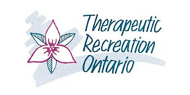
Late last year, I was asked by Joanne Brohman at Therapeutic Recreation Ontario to re-design their logo. They had been working with a web design company called i4 to update their site and wanted to bring their logo in up to date as well.

I was excited by the project because I had been in discussions with Joanne and TRO for some time about a redesign and I could finally get to work.
Looking at their old logo - I liked the idea of using the trillium - which helped symbolize where TRO operates but the logo itself provided no clues as to what TRO does and who it helps. The type face and colour were quite dated as well.
The hardest part for me, as it is with most logos, is - how do I represent "visually" what an organization does? It doesn't need to be literal, or - what I like to call - 'smash you over the head' obvious - but it needs to provide some clues to the viewer.
I believe this is probably more important in the charity sector then the commercial sector.
My one concern was I was moving forward without a written creative brief from the client but after some back and forth emails, it was time to proceed.
So - where to begin? Research. I spent time understanding who TRO helps, how they help them and trying to find some visual ideas that I could use to communicate that. I then brainstormed on paper - words and visual ideas.

With most logos, when I finally sit down at my computer, I start looking at fonts/typefaces. All fonts communicate. Some are funny, feminine, angry, powerful, delicate, historical, etc. I wanted: Contemporary, slightly playful, soft edges (more feminine) and sans serif. If I could find a font that communicated those things for me - then I was in good shape when it came to the rest of the logo. I then find fonts that I think will fit the bill and typeset the name of the organization and see what works with the name and what doesn't.
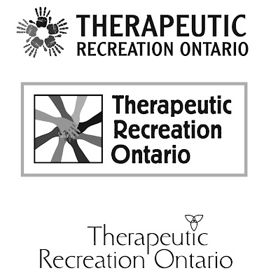
The next step for me is to chose a few of the samples that seem to be working for me and start to add some of my visual clues in. I liked the idea of the trillium and I wanted to give TRO a possible solution that kept that but I also wanted to explore another avenue. I wanted to use hands as well - I felt that hands could represent a lot of different things: healing, togetherness, community... So after trying a number of options, I presented these three logo concepts to the TRO:
After some review, the Joanne wanted to add the tag line as well before she took it to her board.
I always design logo concepts in black and white. Again, because every element can add or detract from another - colour is usually the biggest distraction. If I can get a logo working in black and white, then it should really shine once I start adding colour onto it. As well, with charities, so often we are designing with 1 colour or 2 colours so the black really needs to work.

So after board review, it was felt that we were off the mark. The hands weren't working for them. I believe the feeling was that it didn't address the "recreation" aspect of TRO. So - back to the drawing board.

The lesson here is the importance of a clear creative brief - which should be kept brief (more on that another time). A well written creative brief that both parties sign off on keeps the focus on the end product.

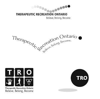
I went back to their site and some of the other Therapeutic Recreation sites that exist. What I failed to realize the first time through was it was 'therapy through recreation'. That was key. Once I got my head around that - both the client and I agreed to move forward with that creative direction - I came up with these:
The ball easily covered the recreation aspect and I loved how it gave the logo some life and movement. I do believe the feedback was unanimous. The first option just had everything going for it and wasn't too quirky or fussy. Now if I could just find a way to fit in that trillium...

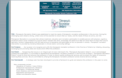
Above is the final logo and below, intergrated within the new web page that created by i4:

The new site and logo are to go live sometime this year and I think that TRO now has a more up-to-date and contemporary identity.

More or less of this sort of thing? Any other comments? Please let me know!
John

Monday, May 7, 2007

Fundraising Blogs and Definitions

Like most people these days, I spend a good half hour to hour going through my mail box, reading emails. I get an email on a regular basis from Mal Warwick, who is considered to be one of the world's best fundraisers. Today's email had a few great reads that you should check out if you have the time. Of interest to me were articles 1 and 2. Article 1 discusses some of the great fundraising blogs out there to check out when you have the time and 2 discusses some easy mistakes to avoid in your appeals. Great stuff.

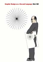
I have a book called "Graphic Design as a Second Language" by Bob Gill. And it gives some great definitions that apply to the world of design. For example:

DESIGN: Design is a way of organizing something. There is no such thing as "good design" or "bad design" - the design is good if it does what you want it to do - bad if it doesn't. In order to have a design, you need something to organize.

PROBLEM/SOLUTION: What has to be organized/communicated is the PROBLEM. Design is the solution. This means that DESIGN can only be evaluated (be judged good or bad), if you know what the design is supposed to organize/communicate, what it is suppose to accomplish. This goes for writing, photography and illustration as well.

That's why there are no absolutes in design. You hear these rules and truths all the time about design, colour, balance, etc which are only valid if they help you accomplish what you wish, otherwise - forget them.

I have worked with a lot of other designers, writers, photographers, etc - and when asked to evaluate what their "solution" was to a "problem" - the first thing I ask myself is: "Does it solve the problem?" - NOT - "Do I like it?"

I ask all of my clients to evaluate the work I do the same way. Don't let your subjective opinions get in the way of the job that you've hired a professional to do.

STATEMENT: I am given a project: design a logo for charity. Whatever my solution is - the logo MUST communicate SOMETHING. If the STATEMENT (which comes from "the charity" is boring, then chances are the solution will also be boring. A case in point: I was asked to help Joseph Brant Memorial Hospital to design a word mark for a event they used to run once a year called Scrappers Day. The STATEMENT was: Save your scrap metal for Joseph Brant and make our hospital stronger. My SOLUTION was:
Thoughts? Agree? Disagree? Let me know.

Wednesday, May 2, 2007

My Two Cents: Flick Off Campaign

If you live anywhere near Ontario, Canada - you heard about the relatively new initative called "Flick Off" which has all sorts of people in the media and general public up in arms and in a tizzy. In an earlier post, I wrote about design being appropriate.

The campaign - brought to you by a Toronto "Enviro Agency" called Key Gordon and the provincial Liberal government - targets youths to reduce their energy consumption. The problem educators, media, government opposition parties and Joe Taxpayer are having with the campaign is the way the typeface communicates "Fuck Off" - especially from a distance. On the homepage a call to action tells you: "We need you to FLICK OFF, and tell everyone you know to FLICK OFF. The more you do it, the cooler it gets. The planet, that is."

Now - let's be truthful here folks. Kids swear - a lot. And they like things that rub their parents, teachers - basically anyone - the wrong way. This logo is very contemporary, uber-cool and urban, and kids will think it is cool. It is appropriate to the audience. Will the message get through? Of course it will. Will more kids turn off the lights and work to conserve energy? I think so - kids today are quite savvy- but forget about a proven result.

The people who don't like it aren't the ones being targeted. I think it has done it's job already. It's current, it has raised awareness and the kids love it.

That's my two cents.

Tuesday, May 1, 2007

Case Study #1: Dr. Bob Kemp Hospice

Recently I was asked to do a makeover of a newsletter for the Dr. Bob Kemp Hospice which is in Hamilton, Ontario.

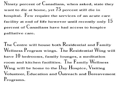
As part of my process I sat down to do the appropriate research on what the Hospice is, who it helps, who supports the Hospice and how they support it. They were in the process of wrapping up a capital campaign to help build a new hospice.

It came time to sit down and take a look at their newsletter as it presently was.

My first thoughts were considering the audience, the typeface/font seemed dated and appeared too small and condensed vertically.

There was nice white space around the paragraphs and around the headline so there was some room to play with. My other concerns were with the generic name and small images. They were also paying for printing 4 colours (cmyk) so I wanted to utilize that a bit more.

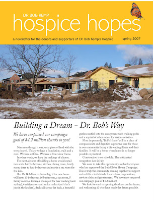
So what did I do? I started with the name first. The newsletter was going to supporters and donors and I wanted it to have a more uplifting name. "Hospice News, Hospice Bulletin, BK Bulletin, Kemp News"... none really inspired. But "Hospice Hopes"- we were getting somewhere. I felt the dark blue was a little cold and lifeless so I played with greens and yellows - colours that are alive and vibrate with energy... The use of the logo, which also may be updated at some point in the future wasn't really helping - but I liked the idea of metamorphosis and life. A small visual of a butterfly gave it that bit unique-ness that it needed. I chose a contemporary and clean typeface for the masthead called "Abadi" and "Adobe Caslon" for all body copy.

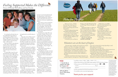
I wanted bigger visuals - which have more impact and also help to make the newsletter not seem so copy heavy. So this is what I came up with:


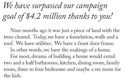
A closer look at the body copy:

One other thing I did, was leave the double spaces in between the sentences. Depending on the piece, sometimes I leave them in or remove them. At smaller font (point) sizes, having the double spaces also help with readability, even though from a typographic point of view it is incorrect.

With the inside pages, I pushed for a less in more approach. But we had some great content so cutting copy was not easy. I opened the margins up as much as possible, bleed images off the sides and tried to give each element it's own space to breathe.

Thanks to the Hospice for allowing me to help with their newsletter and congratulations on reaching their goal for their captial campaign.
 

Ringtones